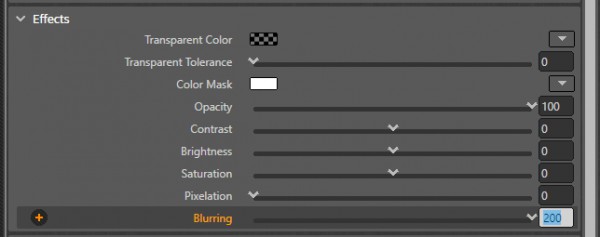
If you use the slider of the Blurring property on the Renderer element, its maximum value is limited to 10. However, you can enter any higher value manually, in the textbox (see below):
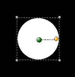
With different blurring ratios, the white disk 160x160px would appear like this:
Blurring=0
Blurring=75
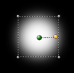
Blurring=200
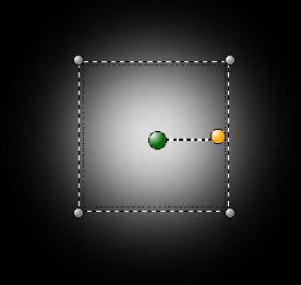
Alternatively, you can define the blurring effect by XAML code (for the XAML materials). This approach also allow setting the kernel type either to "Gaussian" or "Box":
<Ellipse Width="160" Height="160" Fill='#FFFFFFFF' >
   <Ellipse.Effect>
      <BlurEffect Radius="75" KernelType="Box"/>
   </Ellipse.Effect>
</Ellipse>
The 'box-kernel' effect would look like this:
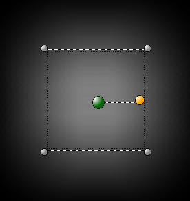
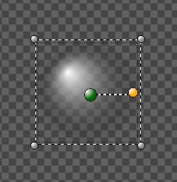
Finally, you can use XAML gradient brush to create more advanced blurring effects, e.g. non-linear gradient stops and displaced blurring center.
XAML code with the gradient brush:
<Ellipse Width='160' Height='160'>
	<Ellipse.Fill>
		<RadialGradientBrush GradientOrigin='.3,.3'>
		<GradientStop Offset='0' Color='#FFFFFFFF'/>
		<GradientStop Offset='1' Color='#00000000'/>
		</RadialGradientBrush>
	</Ellipse.Fill>
</Ellipse>
Rendering result:
